Subscribe to our newsletter
What The Data Shows Us When Non-Voters Vote!
7th June 2017
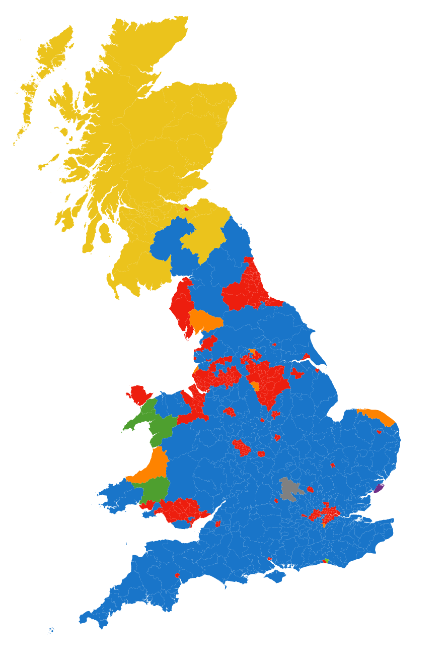
Digital Science’s Lead Data Quality Engineer Ian Calvert today has published an interactive map which allows you to visualise what the 2015 elections results would have been like if everyone in the United Kingdom had exercised their vote.
Key Findings Include:
- In 2015, roughly a third of the electorate did not cast a vote. This is almost the number of people that voted for the Conservatives. In fact, “no vote” was the largest group in 340 seats.
- This means, if all the “no votes” were a party, they’d have a majority in the House of Commons.
- The disenfranchised have a lot more power than they think.
- There is rarely such a thing as a truly ‘safe’ seat.
To explore what could have happened – if only they had turned out. Here’s how you use the map (click on the image below).
- Drag the sliders up for a particular party
- Sliding all the way up means that every non-voter turned out and voted for that party.
- Alternatively, try seeing what would have happened if they’d all voted for the party that actually came in second in that seat.