Subscribe to our newsletter
Compressing Genomes for Fun and Profit with Pareto, Docker and Gnuplot
View the original post on John Lees-Miller’s personal blog.
TLDR: If you have a lot of data to compress, it’s worth evaluating different compression programs and settings on a subset of your data. This article describes a process and a tool I wrote to automate it, based on some (basic) ideas from multi-objective optimization. In my experience, new compression programs, and particularly Facebook’s Zstandard, have often won over widely used incumbents.
I recently found myself with a large dataset that I needed to compress. Ordinarily, I’d just gzip it and carry on with my day, but in this case it was large enough to make me think twice about the cost of storage and transfer and the cost of machine time for compression and decompression. I decided to spend an hour or two trying out some different compression programs and… three weeks later, I have written a bunch of code and this article. Why spend two hours doing when you can spend three weeks automating, I always say!
It turns out there many compression programs to choose from, and each one typically has at least one parameter to tune, a ‘compression level’ that trades off time and memory against space saved. For example, the Squash compression benchmark includes 46 programs with a total of 235 possible levels, at the time of writing. While such benchmarks are useful in general (and also interesting), they don’t tell you what program and level will work best on your particular dataset. To find that out, you need to run some experiments.
This article describes the process and supporting tooling that I used for these experiments. We’ll see some nice applications of multi-objective optimization theory and Pareto optimality, why Docker is very useful for this type of task, and lots of plots from gnuplot. My original application was proprietary, so instead I’ll use a made up (and more fun!) example:
Suppose you’re at a personal genomics startup, 32andYou1, and you expect to be sequencing genomes for thousands of customers. You will need to store all of those genomes and, as your scientists discover new tests to run, get them out of storage for processing. Should you compress the genomes for storage, and if so how?
Let’s go through the process with this example.
Step 1: Choose a Sample
Here we’re assuming that the dataset is very large and/or isn’t all available yet, so we need to choose a subset of our data to experiment on. Ideally, it should be a random subset so we get an unbiased estimate of the performance on the dataset as a whole. If the dataset comprises many files, picking a random subset of the files would be a good choice.
For our genomics example, we can (quite remarkably) just download the sequence from the human genome project. In uncompressed 2-bit binary format2, it weighs in at 835,393,456 bytes, or 0.778GiB, where 1GiB = 10243 bytes. At the risk of dating myself, that’s a bit more than a CD-ROM, but much less than a DVD.
Step 2: Run Experiments
Once we have a sample, we are ready to run some programs on it. The programs I chose, based on some Googling and availability of packages in Ubuntu, were brotli, bzip2, gzip, 7z, xz and zstd. Each program provides a varying number of compression levels, which are documented to varying degrees in the man pages or –help options.
I wrote a small utility in ruby to run the programs and collect the results. For each program and level, we are mainly interested in measuring
- the time it takes to compress the data,
- the resulting compressed size,
- the time it takes to decompress the data, and
- peak memory usage.
For the results to be accurate, we need to run the experiments on hardware that is representative of what we’ll use for the full dataset — CPU, memory and I/O speed are all important factors. It’s therefore important that the utility that runs the programs is portable. That can be challenging, however, particularly for the newer compression programs, which are often unavailable as packages or have different package names (and sometimes program names) on different platforms. And I have yet to find any portable way of measuring peak memory use.
To address these portability challenges, I packaged the utility and its many dependencies as a Docker image. Docker lets us build one image that can run on a wide variety of Linux-based systems, and it causes no noticeable performance degradation, so the results remain representative of what you’d see if you were running the programs natively.
It’s also possible to run the utility in Docker on Mac and Windows, but ongoing issues with the I/O performance of docker volumes on those platforms mean that the results are not very representative of what you would see if you ran the programs natively. That situation is improving rapidly, however, so hopefully soon this approach will also extend to non-Linux platforms.
For the genomics dataset, I ran the experiments on an m3.medium virtual machine instance on Amazon EC2. Here’s the results table as a CSV (view on figshare).Now we’re ready to see what the data look like.
Step 3a: Analyze the Data with Plots
Let’s start with just two variables: compression time and compressed size, which are usually the most important. The plots are generated using the utility and gnuplot, as described in the appendix. In our first plot, each point represents a compression program, which is indicated by its symbol, and a corresponding compression level:
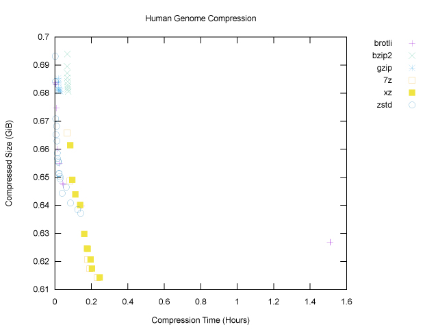 For both axes, smaller is better: we want smaller compressed size and less time taken for compression. The main things that stand out on this first plot are:
- The most widely used programs,
gzipandbzip2, did not do much on our genome file; they cluster near the top left corner, which means that they didn’t take very long to run, but they didn’t achieve much compression either, even at higher compression levels. brotlihas an outlier on the far right: its highest compression levels took over an hour on this one file. This outlier stretches the x axis, making the plot harder to read. And perhaps there was a bit too much information to begin with, in any case.
To narrow the field, we can focus our attention on the Pareto frontier, which is defined as follows: a point on this graph is on its Pareto frontier if there is no other point that is better according to both compressed size and compression time. Or, turning that definition around, if a point is not on the Pareto frontier, that means that there’s some other point that’s better on both axes, so we should always prefer said other point. Removing points not on the Pareto frontier gives us a much clearer plot:
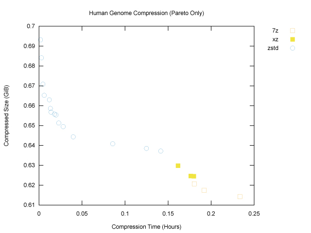
The brotli outlier is gone, and we can see that of the six programs tested, only three, namely 7z, xz and zstd, have made it onto the Pareto frontier. The graph also nicely shows that, for our genome file, zstd won for fast, light compression (top left), and xz and 7z won for slower, heavier compression (bottom right).
Now let’s annotate each point with the corresponding compression level:
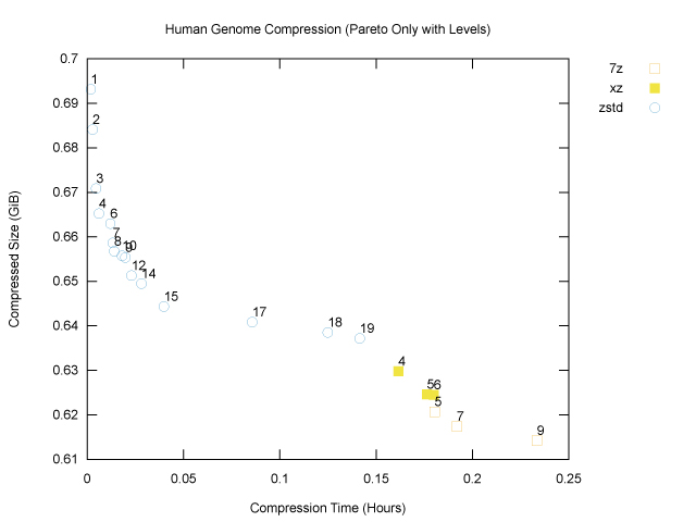
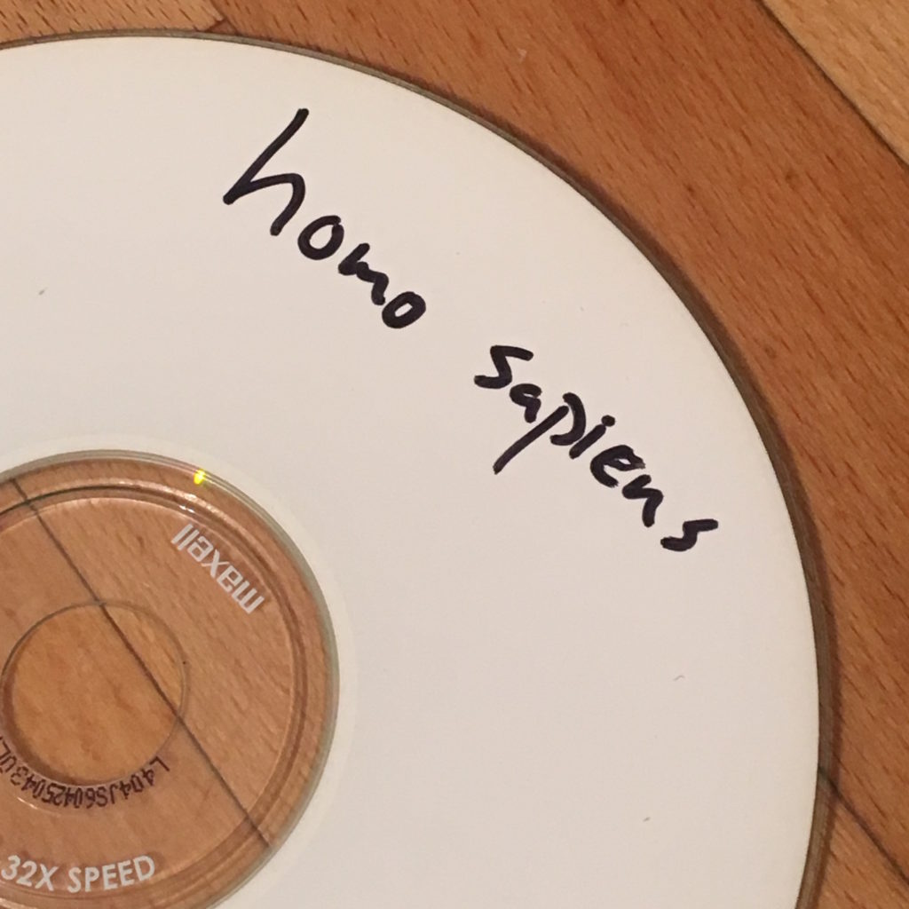
As we might expect, increasing compression levels generally lead to smaller compressed size and also longer compression times, as the programs work harder. We can now see that if our goal is to minimize compressed size, 7z at compression level 9 (the maximum) is our winner for the genome file, at 659,486,454B, or ~629MiB. That will fit nicely on a standard CD-ROM. Fortunately (?) my laptop is sufficiently old that I could test this, hence the cover image for this article!
While these plots are informative, they are not enough to solve more complicated problems, such as the genomics problem, in which we want to trade off compressed size with compression and decompression time. To do so, we can bring these variables together onto a common scale: cost.
Step 3b: Analyze the Data with Costs
Choosing a compression program and level is basically an optimization problem: each compression program and corresponding level is a candidate solution, and we want to find the solution with minimal cost. A ‘cost’ is just a single number for each solution that describes how expensive it is in dollars and cents, or some equivalent scale.
For the genomics problem (and for a surprising variety of other problems), it’s enough to use a linear cost function with three cost coefficients:
- dollars per GiB of compressed size,
- dollars per hour of compression time, and
- dollars per hour of decompression time.
We measured these three variables for each solution in step 2, so we can compute a solution’s cost just by multiplying them by the corresponding cost coefficients and adding up. Having separate cost coefficients for compression and decompression is useful if, for example, we need to decompress data more times than we need to compress it, which is often the case.
While peak memory use may also be a factor, we usually care about it only insofar as we don’t want to run out of memory if we are using an embedded system or small-memory cloud server, so we can usually treat compression and decompression memory use as constraints, rather than quantities to be optimized.
How we set the cost coefficients depends on what we plan to do with the data and on the basic hardware costs. For example, let’s assume that we’re working on Amazon EC2 with an m3.medium instance, which is where I ran the experiments, and that we’ll store the data on Amazon S3. Looking at the AWS pricing tables, we can work out that, at the time of writing, compute time (for either compression or decompression) will cost $0.073/hour, and storage will cost $0.023/GiB for each month that we store the data.
For the genomics problem, let’s make a spreadsheet (XLSX) to calculate the cost coefficients from these basic costs. Let’s assume that:
- We start out with 1000 customers in month zero (now) and grow at 20% per month.
- We model 36 months out (which is pretty ambitious for a startup). At 20% growth per month, we’ll have about 700k genomes (users) after three years.
- Each month, we compress and store the genome for each new customer we acquire.
- Each month, we also discover one new test, for which we will decompress all of our stored genomes, run the test on each one, and report the results to users.
- Because the costs will be incurred gradually over time, we need to take into account the time value of money by finding present values of the costs each month. Since we’re a biotech startup, our cost of capital is fairly high, at 20% per year, which is equivalent to 1.53% per month. We discount costs at this rate.
Here’s an extract from the spreadsheet that implements these assumptions:
| Month | 0 | 1 | 2 | … | 36 |
| Growth per Month in Total Genomes | 20.0% | 20.0% | 20.0% | … | 20.0% |
| Total Genomes at Month End | 1000 | 1200 | 1440 | … | 708802 |
| New Genomes in Month | 200 | 240 | … | 118134 | |
| Average Genomes Stored in Month | 1100 | 1320 | … | 649735 | |
| New Tests per Month | 1 | 1 | 1 | … | 1 |
| Cost of Capital per Month | 1.53% | ||||
| Discount Factor | 100% | 98% | 97% | … | 58% |
| Discounted Cost / GiB | $0.0230 | $0.0227 | $0.0223 | … | $0.0133 |
| Discounted Cost / Hour | $0.0730 | $0.0719 | $0.0708 | … | $0.0422 |
| Present Values | |||||
| Size Cost / GiB / Genome | $56,052.75 | $24.92 | $29.45 | … | $8,648.09 |
| Compression Time Cost / Hour / Genome | $32,346.65 | $14.38 | $17.00 | … | $4,990.60 |
| Decompression Time Cost / Hour / Genome | $177,906.56 | $79.09 | $93.48 | … | $27,448.30 |
The last three rows give, for each month, the discounted storage costs per GiB per genome and discounted compression and decompression costs per hour per genome. Adding these up across all the months gives their total present values, shown in bold, which are our cost coefficients.
For example, if through compression we can achieve 0.6513 GiB per genome, the storage cost coefficient of $56,052.75 / (GiB / genome) implies that the present value of our discounted monthly storage costs would be:
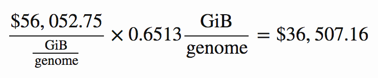
As it happens, that is indeed the storage cost for the lowest-cost solution. Applying the above cost coefficients to each solution, we find that the one with lowest total cost is zstd at level 12. Here is a summary of its key metrics, in which the costs are reported in thousands of present value dollars.
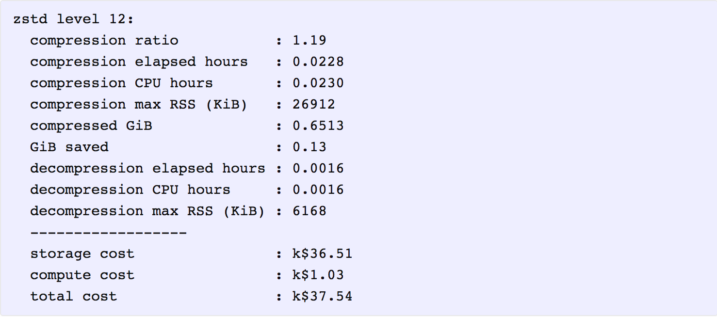
It is interesting that even though the total cost ($37,540) is dominated by storage costs ($36,510), compressing the data further with a higher level of zstd or another program, such as 7z, does not provide enough additional compression to offset the additional compute cost for compression and decompression.
Technically, we’re done: we don’t need any plots when optimizing with a cost function. However, it’s still helpful to be able to visualize the results. Given that there is a lot of uncertainty both in the extrapolation from one genome to many and in the business model that generates the cost coefficients, we should be thinking about the sensitivity of our conclusion to this uncertainty. One way to get a feel for it is to again look at the Pareto frontier of a plot of size costs and time costs. To stay in the world of two dimensional plots, we can simply add the compression and decompression time costs together, as follows:
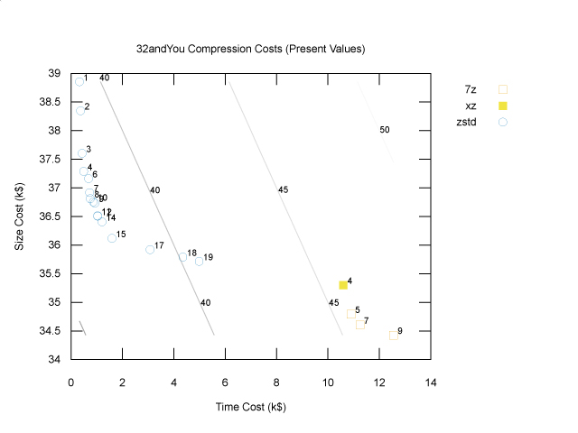
The diagonal lines are cost contours: total cost is constant along these lines. The optimal solution, zstd at level 12, lies on a parallel contour line (not shown) closer to the origin with lower cost, namely $37,540. If storage costs were to increase relative to compute costs, the cost contours would be less steep, and we might be better off choosing a slightly higher compression level; however, the storage costs would have to increase by quite a lot for us to prefer the 7z points in the bottom right. If storage costs were to decrease relative to compute costs, the cost contours would be steeper, and we might find that a lower compression level would have been better, but again they would have decrease a lot before we decided to use no compression at all. To know for sure, we’d have to try different cost coefficients, but at least this plot gives us some intuition about how to approach that sensitivity analysis.
Finally, the plot above only shows the Pareto frontier, which does not include any gzip or bzip2points. However, looking at the full cost summary, we can see that if we’d used bzip2 at its default level (9), the total cost would have been $46,540, and if we’d used gzip at its default level (6), the total cost would have been $39,700. So, in this case using zstd instead of gzip is saving us $2,160 in today’s dollars (since these costs are present values). Is that enough to warrant switching to a newer, less proven technology? I guess it depends on your appetite for risk. As the saying goes, nobody ever got fired for using gzip!
I think the genome dataset is actually quite a tough one to compress; in my own practice, I’ve seen much larger cost differences between zstd et al. and gzip that do make the newer programs more appealing. And of course, there’s only one way to find out whether it will be worth it in your context — go through a process like this one.
Thanks to Hope Thomas for reviewing drafts of this article.
If you’ve read this far, perhaps you should follow me on twitter, or even apply to work at Overleaf. :)
Appendix: How to Reproduce the Plots
Install
To install via docker, you just need to run
$ docker pull jdleesmiller/compare_compressors
Alternatively, you can install the utility via ruby gems, but then you have to make sure that all of the dependencies are installed; the best place to find the list of dependencies is the Dockerfile.
To check that it’s working, you can run the help command:
$ docker run --rm jdleesmiller/compare_compressors help
Commands:
  compare_compressors compare <target files>  # Run compression tools on targ...
  compare_compressors help [COMMAND]          # Describe available commands o...
  compare_compressors plot [csv file]         # Write a gnuplot script for a ...
  compare_compressors plot_3d [csv file]      # Write a gnuplot script for a ...
  compare_compressors plot_costs [csv file]   # Write a gnuplot script for a ...
  compare_compressors summarize [csv file]    # Read CSV from compare and wri...
  compare_compressors version                 # print version (also available...
Run Experiments
To rerun the data collection step, download the genome in 2-bit format and put it at data/hg38.2bit. Then run
$ docker run --rm \
  --volume `pwd`/data:/home/app/compare_compressors/data:ro \
  --volume /tmp:/tmp \
  jdleesmiller/compare_compressors compare data/hg38.2bit >data/hg38.csv
where:
- The
--rmflag tells docker to remove the container when it’s finished. - The
--volume `pwd`/data:/home/app/compare_compressors/data:roflag mounts./dataon the host inside the container, so the utility can access the genome file. The trick here is that/home/app/compare_compressorsis the utility’s working directory inside the container, so the relative pathdata/hg38.2bitfor the sample files will be the same both inside and outside of the container. The:romakes it a read only mount; this is optional, but it provides added assurance that the utility won’t change your data files. - The
--volume /tmp:/tmpflag is optional but may improve performance. The utility does its compression and decompression in/tmpinside the container, and all of the writes inside the container go through Docker’s union file system. By mounting/tmpon the host, we bypass the union file system. (Ideally, we’d just set this volume up in the Dockerfile, but unfortunately it’s 10x slower on Docker for Mac and Windows; hopefully that will improve soon.)
Alternatively, note that you can just download the results I generated (view on figshare) and put them in data/hg38.csv for analysis.
Analyze the Data
The last plot in ‘Step 2a’ above comes from the utility’s plot command. There is no need for a /tmp mount, but the utility still needs to be able to read the original data files, just to find their original (uncompressed) sizes. The command is:
$ docker run --rm \
  --volume `pwd`/data:/home/app/compare_compressors/data:ro \
  jdleesmiller/compare_compressors plot \
  --title 'Human Genome Compression (Pareto Only with Levels)' \
  --terminal 'svg size 640,480' --output hg38_pareto_levels.svg \
  data/hg38.csv | gnuplot
The preceding two plots in ‘Step 2a’ were generated by adding the --pareto-only false and --show-labels false flags.
The plot in ‘Step 2b’ comes from the utility’s plot_costs command, which takes the three cost coefficients, as follows.
$ docker run --rm \
  --volume `pwd`/data:/home/app/compare_compressors/data:ro \
  jdleesmiller/compare_compressors plot_costs \
  --gibyte-cost 56.05275303 \
  --compression-hour-cost 32.34664799 \
  --decompression-hour-cost 177.906564 \
  --currency 'k$' --lmargin 4 \
  --title '32andYou Compression Costs (Present Values)' \
  --terminal='svg size 640,480' \
  --output=hg38_costs_32andyou.svg \
  data/hg38.csv | gnuplot
(The lmargin flag is apparently needed to work around a bug in gnuplot that cut off the y axis label.)
Finally, the textual summary was generated by the summarize command, as follows.
$ docker run --rm \
  --volume `pwd`/data:/home/app/compare_compressors/data:ro \
  jdleesmiller/compare_compressors summarize \
  --gibyte-cost 56.05275303 \
  --compression-hour-cost 32.34664799 \
  --decompression-hour-cost 177.906564 \
  --currency 'k$' \
  data/hg38.csv
The utility also contains some other commands, such as plot_3d for a plot of compressed size, compression time and decompression time, and many other options I have found it useful to add. See the README on GitHub for more information.
Footnotes
- Amusingly, if you google this, you’ll find the company I was indirectly referring to. Apparently Google gets jokes now. I should also mention that, as I understand it, current personal genomics services don’t actually work this way. They look for a fixed set of genetic markers rather than actually sequencing the whole genome. IANAB.
- The genetic code uses only four letters, T, C, A and G, and happily we can represent each of those four letters as a two-bit number, 002, 012, 102 and 112, respectively. The 2-bit data are already compressed relative to simply writing the text in ASCII, which would use 8 bits (1 byte) per letter — 4x compression almost for free! However, the genome contains many repeating sequences, so we can reasonably expect a clever compression algorithm to reduce the compressed size even further.

John Lees-Miller is a co(de)founder at Overleaf, an online editor that helps scientists write papers collaboratively. He did a PhD on how to efficiently operate fleets of driverless cars, so we’ll be ready when they get here. That was in the engineering mathematics department at the University of Bristol. He was part of the team that delivered the world’s first Personal Rapid Transit system at London’s Heathrow Airport in 2011 — computer-guided taxis on dedicated roads. John makes things work!