Subscribe to our newsletter
Bringing Narrative to Research Collaboration Networks in 3D
Simon Porter is Digital Science’s Director of Innovation. Simon came to Digital Science from the University of Melbourne, where he has worked for the past 15 years in roles spanning the Library, Research Administration, and Information Technology. Beginning from a c ore strength in the understanding of how information on research is collected, Simon has forged a career transforming university practices in how data about research is used, both from administrative and eResearch perspectives. In addition to making key contributions to research information visualization and discovery within the university, Simon is well known for his advocacy of Research Profiling Systems and their capability to create new opportunities for researchers. Over the past three years, Simon has established and run the annual Australasian conference on research profiling. In 2012, Simon was the program chair of the third annual VIVO conference.
In over a decade of creating research university collaboration diagrams, the response that I’ve come to expect when presenting them is usually, “Pretty isn’t it…”, followed by a pause, and then, “…what does it mean?” – which is fair enough. Collaboration graphs without any surrounding narrative can really only be encountered as art. Identifying interesting features in a network requires some knowledge of how they were made.
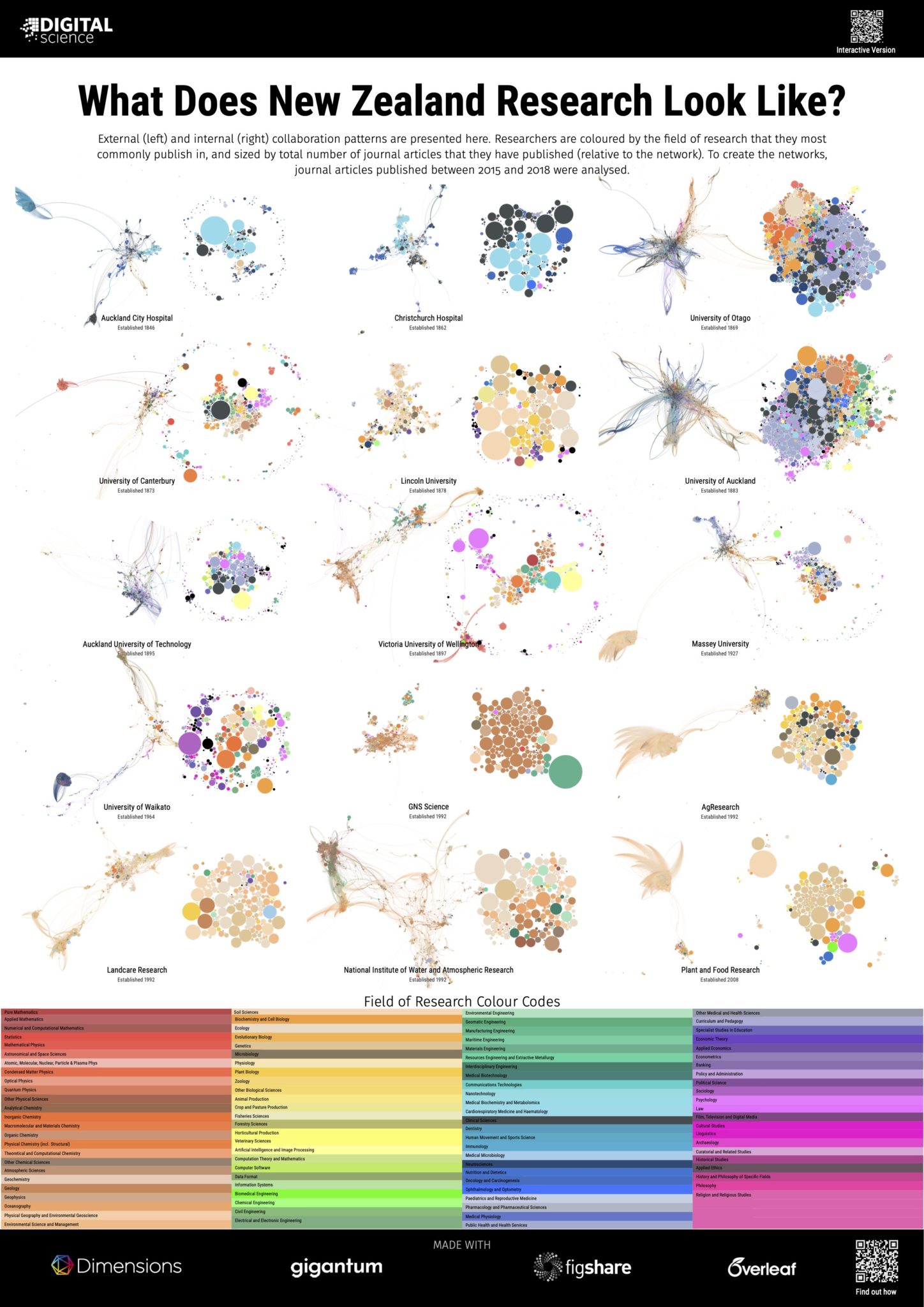
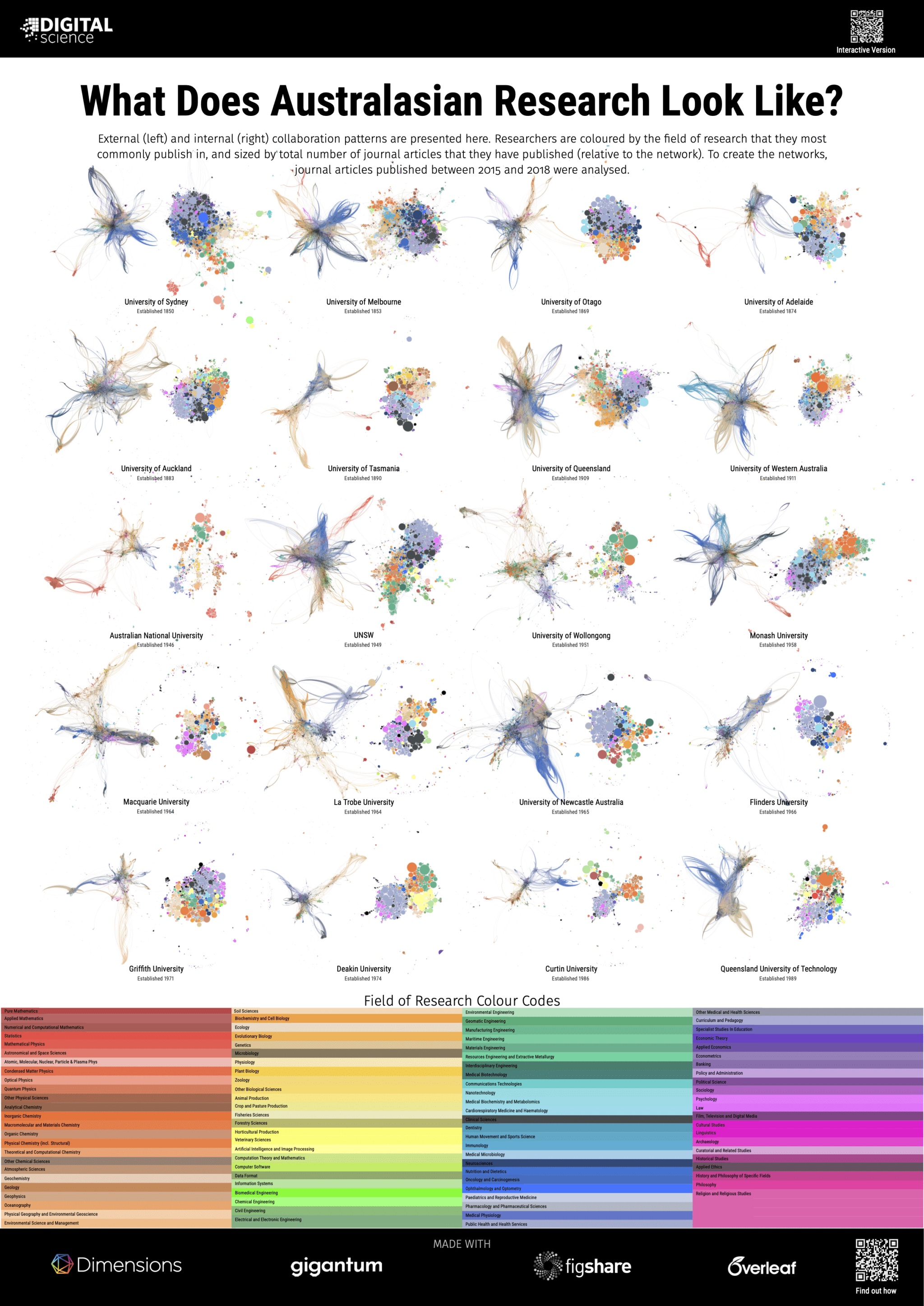
That said, research collaboration graphs do play a productive role in highlighting the cultural differences between different types of disciplines and institutions. In our 2019 project, ‘What does a University look like?’, we showed that a large-scale comprehensive institution looks very different to an institution focused on science and engineering. Country-level differences in culture can also be seen. For example, two related posters in this project highlight the differences between a distributed system of institutions in New Zealand that focuses on different and complementary areas of research, and a larger university sector in Australia that produces many more comprehensive and competing institutions. Coming soon after the launch of Dimensions, the original 2019 project showcased both the quality of the research network and research classifications within Dimensions, while demonstrating how much it was possible to do with the Dimensions API – though it did take a while to download all the data! With the launch of Dimensions on Google BigQuery and the ability to gather the data for networks in
seconds rather than hours, I thought I would revisit the project again, this time with a focus on narrative. Imagine you are in a gallery, standing in front of a large framed picture of a network diagram. What story does it tell you? It is most likely to be a story about the interplay and size of disciplines within an institution. How does physics interact with medicine? How does engineering connect with both the biological sciences and pure chemistry? Where are the intersections with education? In exploring these questions we also gain a sense of distance between disciplines. In this way, network diagrams act as a map as our eyes wander across a landscape of cooperation.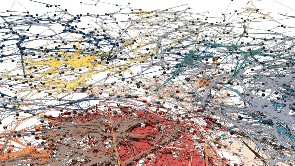
A story that tells us how disciplines are connected requires knowledge of where researchers are from. Using Dimensions we can assign a discipline to an individual by looking for the research classification that they most commonly publish in. Dimensions has many different classifications to choose from however, as the human eye can only differentiate a limited number of colours, I chose to use the Units of Assessment classification created in the UK for the Research Excellence Framework (the REF) as a high level, yet sufficiently broad scheme. Exploring interconnecting disciplines also requires a way to group researchers that are working together. To shift focus from individuals to groups within the network I used the Leiden algorithm from CWTS (also used in VOSviewer) to identify well-connected clusters of researchers. Having already used colour to indicate discipline, clusters are highlighted on the graph by hiding the links between clusters and accentuating the links within a cluster through the use of edge bundling. Clusters that are related to each other can be inferred by their proximity on the network, as well as the discipline mix of researchers within the cluster. In an analogous method to assigning a discipline to each researcher, I assigned a colour to the edges within a cluster based on the majority discipline of the researchers within it.
Playing with edge bundling, as it can help reveal structure in graphs, but how much is too much? For me, it looks like setting a (hammer_bundle) initial param of .3 seems about right. Thoughts? (animation @matplotlib w camera) 1/3 pic.twitter.com/On13C8A64f
— Simon Porter (@sjcporter) November 28, 2020
As clusters have been derived independently from the algorithm that lays out the network, the final challenge is to differentiate between clusters that overlap across the network. Indeed, it is often interesting to identify instances when they do. To handle this, I chose to animate the graph, highlighting each cluster above a certain size in sequence, starting with Clinical Medicine (A01), and moving progressively through the Units of Assessment through science, engineering, social sciences, and the humanities. In this way, the network is presented as a tour through the disciplines providing a narrative structure for the entire network. As Units of Assessments are quite broad, I also used the Fields of Research categorisation at the 4 digit level to provide another description for each cluster. By highlighting the four researchers within a cluster that have published the most, each cluster gains a further identity. To help identify clusters from different disciplines that overlap with one another, I created a 3-dimensional model of the network and gave each Unit of Assessment a different layer in the representation. Unit of Assessment A01 (Clinical Science) forms the base of the diagram. From there the layers move up through medicine, engineering, sciences, and humanities. The end result, created in this case for the University of Cambridge, is presented below. Pretty isn’t it? Although hopefully now the story it has to tell is embedded in the encounter.
Some Additional Technical Things of Note This project makes use of a new graph layout engine called BatchLayout, which I use in conjunction with Graphviz to reduce the number of overlapping nodes. Edge bundling is achieved using the Datashader library. Although the end result is rendered in Blender, all of the 2D development was rendered using matplotlib. You can find a Google Colab Notebook with all the steps up to 3D rendering here. The code for the whole project, including the Python script that builds the network in Blender can be found in my Gigantum repository here. Gigantum was really helpful here, as it made it easy to switch between my local computer for development, and a more powerful machine that didn’t mind being on for several days for 3D rendering. Have a go yourself, and tell us how you get along!