We are on tour!
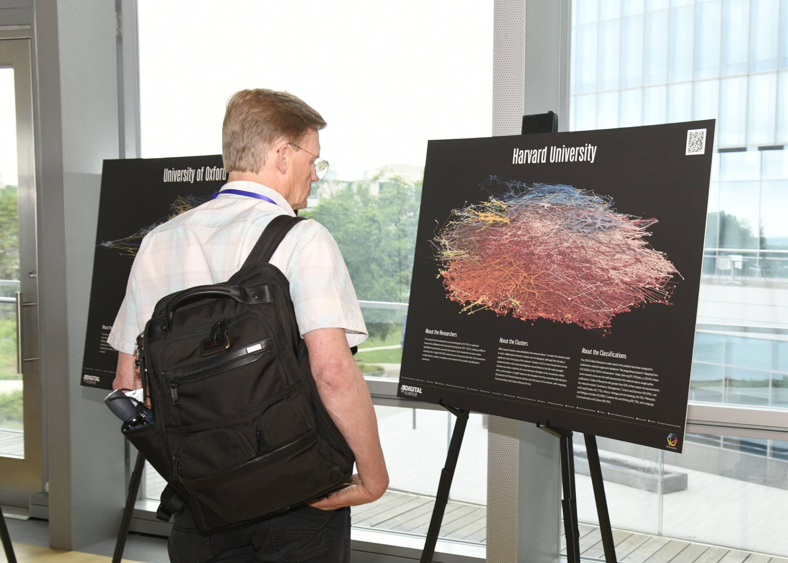
Recently, we had the chance to make a mini exhibit of our ‘What does a University Look like project’ at the International Conference of Science of Science and Innovation in Chicago. Placed prominently in the main auditorium, the posters have triggered many interesting conversations around the structure of institutions – particularly how different universities undertake interdisciplinary collaboration. I have noticed that whilst many people encounter the posters as art, people linger longest when it is their own university pointing out structural, and historical reasons why a cluster might look a certain way.

For the conference, we chose seven Universities. Northwestern University and University of Chicago were selected as universities in the area. The remaining five universities were chosen to illustrate different university shapes. Harvard University was chosen to represent a medically-focused university, and also showed off its enormous scale of 62,000 affiliated researchers. MIT and ETH Zurich represented the shapes of institutes of technology. The University of Oxford and Peking University were chosen as two different examples of comprehensive universities. Both universities show a balanced set of disciplines, however their shapes are quite different. Oxford exhibits a common shape of disciplines wrapped around a clinical sciences core. The University of Peking on the other hand, is a tale of two halves, with almost two independent clinical and technological sides.
Examples of medically focused universities

Examples of comprehensive universities
Examples of technology focused universities

Access all seven posters and more
You can find all seven posters as additions to the ‘What does a university look like’ project in figshare.
What does a University look like Primer
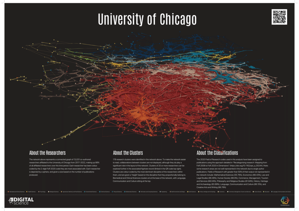
What does a University look like? By modelling data from Dimensions into a 3D visualization tool called Blender, we present a new way of exploring university research collaboration diagrams in a consistent format.
To create the university networks we use Dimensions to extract a coauthorship network based on university affiliation. The network is then given shape using the BatchLayout algorithm. To add color, we’ve used the 2020 Field of Research (FoR) codes, to represent research discipline, and we’ve designated a color to each one of those codes. Each single point of color represents an individual researcher coded by the 2-digit FoR they’re most associated with; researchers are depicted by a sphere, and the size of the sphere is based on the number of publications that researcher has produced.
To add depth, we then apply algorithms developed by CWTS at Leiden University to determine research clusters – co-authorship networks – within a specific university. These clusters are then layered on top of each other by discipline, with Clinical Science clusters at the bottom, then moving up through Health Sciences, then Science and Engineering, and Linguistics at the top.
More on this project: https://digital-science.com/blog/2023/05/discovering-galaxies-of-research-within-universities/